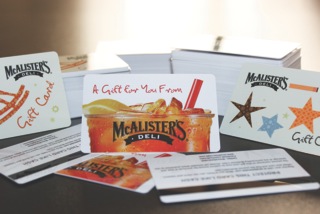
Why the Design of Your Plastic Cards Matters
 The look of your company’s website, brochures, newsletters and emails says a lot about who you are and how you run your business. It’s no different when it comes to the design of your gift cards and other types of plastic cards.
I find it interesting when customers send me their own designs, and the images are low resolution. Or the layout of the card itself doesn’t work with the print options they want. My first thought always is, “Don’t you care how this card will look to your own customers?”
Design Your Plastic Cards with Branding in Mind
Your gift card should be an extension of your brand. Obviously, it should include your logo, as well as other graphics that support the brand experience your customers have come to expect. What separates your company from your competitors? How can you convey that in the design of your plastic cards? You should consider these questions before printing your plastic cards. And, if you’re creating cards for your loyalty program, make sure the program itself is unique and truly rewarding!
Design Your Plastic Cards with Quality in Mind
A couple weeks ago, I discussed the four things you need to ask about the plastic your cards will be made from. However, while the quality of the plastic itself is very important, so is the quality of the image you’re placing on that plastic! Printing plastic cards is similar to printing on paper. You need a high resolution image to get a crisp, clean looking design. Don’t scrimp on this. Otherwise, your customers will be looking at (or throwing away) a plastic card with fuzzy pictures, wondering if there are other areas of your business where you overlook important details.
Design Your Plastic Cards with Differentiation in Mind
And, while you’re thinking about what separates your company from your competitors from a branding perspective, it’s not a bad idea to think about how you can differentiate your gift cards from theirs, as well.
In addition to the plastic card printing options I mentioned in a post last month, here are some additional ideas to consider. These special finishes will really make your card stand out:
Frosted Matte: This effect makes colors look softer. It is similar to a matte finish, only smoother.
Full-face foil: This option will give your entire card a holographic shine that changes as the card is turned. More than just kids love this look.
Foil Stamping: This is perfect when you want to add just a little shine in certain spots, as opposed to the full-face foil. You can highlight your logo or other important image with a special metallic film to make it eye-catching.
When it comes to printing plastic cards, I hope you’ll remember this trifecta: branding, quality (of both design and plastic) and differentiation. When you add this as “icing on the cake” to an already great product or experience for your customers, they will definitely be more likely to hang on to your card.


