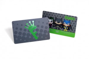
Funko’s Funky Spot UV Business Cards
Everett, Washington-based Funko sells products that are fun, familiar, and a little bit funky, as you might expect from a part of the country that produced counterculture-turned-pop-culture originals like grunge music and Nirvana.
From its beginnings as a bobblehead manufacturer — a product that remains in its lineup — Funko now bills itself as a “pop culture licensed-focused company,” creating their own lines of stylized characters licensed from some of the biggest entertainment brands in the world. Whether you’re looking for a Walking Dead bobblehead set or a block-headed Batman collectible, you can find Funko’s funky figurines on the shelves of major retailers like Target, Gamestop and Walmart.
When it came to designing a business card that represented Funko’s brand attitude and style, it had to have personality and pop. They got the job done by leveraging the subtle (and sometimes not so subtle) art of contrast, combining fun and refinement to create a true original.
Spot UV
Spot UV is a process that adds sheen and dimension. It’s a clear product that adds sheen to pinpointed surface areas. Funko chose to highlight two design elements on their spot UV business cards: their retro Funko logo icon and high-profile licensed characters. For maximum contrast, they did it on top of a frosted gray background, a refined, matte-style finish that makes spot UV pop.
Prominent Branding
When it comes to leveraging their brand, Funko went all out. Not only do their spot UV business cards call out important brand elements, Funko also made smart choices about just which brand elements to spotlight. Number one on the list is Funko’s F-crown logo icon positioned large and in charge in the middle of their card and laid back for style. If that wasn’t enough to make an impression, they slathered it with spot UV to bring out the luster. On the card’s reverse side, Funko dropped in their full logotype, getting their money’s worth by leveraging Warner Bros. iconic Batman brand re-imagined in Funko’s signature style.
Nontraditional Design
Funko designed a business card that is 98 percent about the Funko brand and two percent about the person whose name is on the card. Unlike most business cards, contact information is relegated to a small green strip along the bottom of one side, almost as if out of obligation, but smart and intentional. When you’re a nontraditional company, your brand is your calling card, and from its inventive design to its choice of plastic, there’s nothing traditional about this calling card.


