Getting it Right: Plastic Key Tags South of the Border
One of our goals with the Plastek Cards blog is to educate readers to help them make informed choices, whether it be designing and manufacturing the perfect card, finding the best POS solution, or learning how a gift card program can boost their bottom line.
In today’s post, we thought we’d take a different tack, allowing the customer to educate us, and analyzing why their choices in such things as card material, card content, finish, and design are the perfect combination for their brand and application.
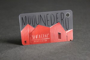
Today, we’ll take a look at a keychain card designed for a restaurant concept across the US/Texas border in Northern Mexico. It’s a loyalty card for a restaurant with a loyal following. Take a moment to click on the image to the left for a better view of the card.
Card Features:
Thickness: 30mil
A 30mil thickness is standard on most cards, especially loyalty cards that will be swiped through a POS card reader. 30mil cards not only hold up better over time, but they look better, providing an appearance of quality. Smart choice.
Material: Clear PVC
Sometimes the best choice of material is the one you can’t see. Clear PVC cards run the gamut from mostly clear to hardly clear, meaning you can use clear card material to highlight what’s printed on the card. Or, use what’s printed on the card to highlight the card material, typically in the shape of an icon or logo. Here, the customer chose to use the clear card material to add depth, and almost a 3D effect, to their artwork, which depicts their iconic restaurant building shape.
Finish: Frosted
A frosted finish was chosen for the clear portion of the card, providing a translucent (not transparent) background for the black text over top. Frosted finishes can also be used over color, adding elegance and contemporary style. In this case, the choice of a frosted finish provides better contrast by reflecting more light than a clear background would.
Color: Four-Color Process Over White Silkscreen
This card features four-color process, also known as “full color.” We won’t get into the nitty gritty of four-color process, but this is a good opportunity to mention the two types of color that are typically printed: spot color and, of course, four-color process (CMYK). This is more something for your designer to worry about, but just don’t mail in a paint sample and expect the color on your job to match it (it’s happened). Oh, and we also can’t print graphics that are saved for the web (RGB). Well, we could, but neither of us would be happy. If you’re wondering why the color on this card is printed over a white silkscreen, it’s to ensure that the artwork on the final product isn’t translucent. It’s the same reason people wear garments under sheer clothing.
Die Cut: Corner Hole
Die cuts come in all shapes and sizes. In this case, a hole was used because it’s a keychain card. “Monedero” means keychain in Spanish. (Intentionally misspelled. We’ll get to that later.) Die cuts can also be used to change the overall shape of a card. Or, even to punch out a shape in the middle of a card.
Artwork: Combines Brand Imagery and Humor
The artwork on this card gets a lot right. Not only does it depict the restaurant’s iconic building and brand color, it also juxtaposes the building’s geometric angles and straight lines with a hand-scrawled font, creating contrast and tension. An element of humor is also integrated into the design. This fast-casual restaurant concept is known for its beef brisket, which explains why “monedero” (keychain in Spanish) is spelled “muuunedero.” While some marketers would argue that a website URL is missing, the restaurant opted for simplicity, and it works.


